
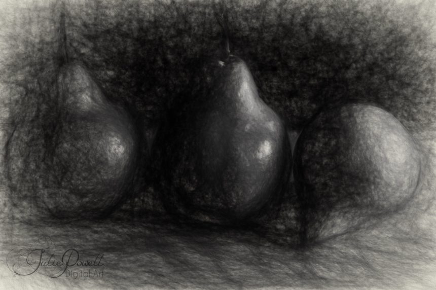
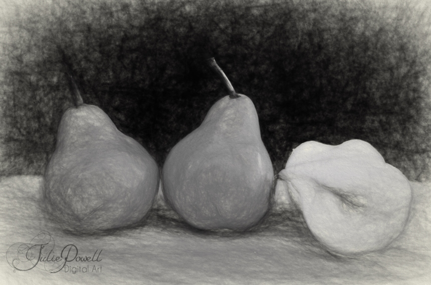
So last week I was explaining how I am working on a Still Life Project, I launched into my first week with gusto, only to find I was not overly happy with some of the images I took. Granted a few are quite good and I will post these here, but I was not getting the look I was after. I was quite happy with the first two of Pears and Apples in a bowl, they are basic, stock standard still life poses. Nice contrast between light and shadow, highlighting the shape of each fruit and the bowl.I went back and did another of the pears, but I cut one pear in half. There is more of a contrast between the pears and the background on the second attempt.

I was not overly happy with the next two, although I guess they look OK on the surface, I think the berries are too ‘real’ in the middle as opposed to the edges, in the first image
Something not quite right about the next one, it looked ok in the camera, but when I started playing around with it; it needs something? I also think there is not enough contrast between light and shadow.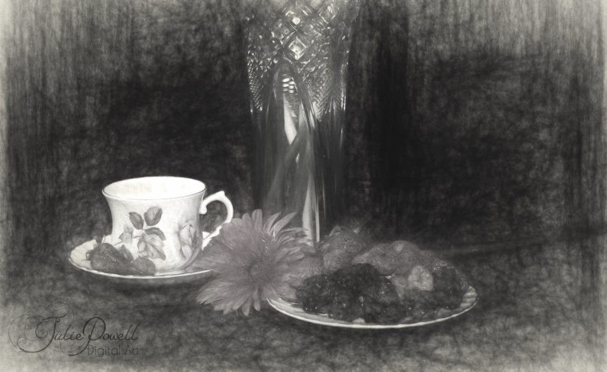
So during the week I went to the local Op Shop and purchased some odds and ends to help build a graphical story into my images. Sure I want to portray light and shadow, but I think it needs to have a purpose?
All of these images are photos taken in the studio, with basic lighting in an effort to create old still Still Life drawings and paintings, they were then converted to Pencil sketches using Topaz Impressions Soft Pencil sketch filter, for this series.
Next week I want to work with some more flowers and perhaps a more painted feel, such as Degas, Cezanne or Picasso? I also want to do some lighter backgrounds and natural light as well as moody studio lighting.
Til next time, Happy snapping…
-Julz

Lovely artwork! If you’re interested in getting it published (along with a link to your blog), visit http://www.artsyteenblog.wordpress.com 🙂
LikeLiked by 1 person